A counting statistic is simply a numerical count of the number of some item such as “one million missing children”, “three million homeless”, and “3.5 million STEM jobs by 2025.” Counting statistics are frequently deployed in public policy debates, the marketing of goods and services, and other contexts. Particularly when paired with an emotionally engaging story, counting statistics can be powerful and persuasive. Counting statistics can be highly misleading or even completely false. This article discusses how to evaluate counting statistics and includes a detailed list of steps to follow to evaluate a counting statistic.
Checklist for Counting Statistics
Find the original primary source of the statistic. Ideally you should determine the organization or individual who produced the statistic. If the source is an organization you should find out who specifically produced the statistic within the organization. If possible find out the name and role of each member involved in the production of the statistic. Ideally you should have a full citation to the original source that could be used in a high quality scholarly peer-reviewed publication.
What is the background, agenda, and possible biases of the individual or organization that produced the statistic?What are their sources of funding? What is their track record, both in general and in the specific field of the statistic? Many statistics are produced by “think tanks” with various ideological and financial biases and commitments.
How is the item being counted defined. This is very important. Many questionable statistics use a broad, often vague definition of the item paired with personal stories of an extreme or shocking nature to persuade. For example, the widely quoted “one million missing children” in the United States used in the 1980’s — and even today — rounded up from an official FBI number of about seven hundred thousand missing children, the vast majority of whom returned home safely within a short time, paired with rare cases of horrific stranger abductions and murders such as the 1981 murder of six year old Adam Walsh.
If the statistic is paired with specific examples or personal stories, how representative are these examples and stories of the aggregate data used in the statistic? As with the missing children statistics in the 1980’s it is common for broad definitions giving large numbers to be paired with rare, extreme examples.
How was the statistic measured and/or computed? At one extreme, some statistics are wild guesses by interested parties. In the early stages of the recognition of a social problem, there may be no solid reliable measurements; activists are prone to providing an educated guess. The statistic may be the product of an opinion survey. Some statistics are based on detailed, high quality measurements.
What is the appropriate scale to evaluate the counting statistic? For example, the United States Census estimates the total population of the United States as of July 1, 2018 at 328 million. The US Bureau of Labor Statistics estimates about 156 million people are employed full time in May 2019. Thus “3.5 million STEM jobs” represents slightly more than one percent of the United States population and slightly more than two percent of full time employees.
Are there independent estimates of the same or a reasonably similar statistic? If yes, what are they? Are the independent estimates consistent? If not, why not? If there are no independent estimates, why not? Why is there only one source? For example, estimates of unemployment based on the Bureau of Labor Statistics Current Population Survey (the source of the headline unemployment number reported in the news) and the Bureau’s payroll survey have a history of inconsistency.
Is the statistic consistent with other data and statistics that are expected to be related? If not, why doesn’t the expected relationship hold? For example, we expect low unemployment to be associated with rising wages. This is not always the case, raising questions about the reliability of the official unemployment rate from the Current Population Survey.
Is the statistic consistent with your personal experience or that of your social circle? If not, why not? For example, I have seen high unemployment rates among my social circle at times when the official unemployment rate was quite low.
Does the statistic feel right? Sometimes, even though the statistic survives detailed scrutiny — following the above steps — it still doesn’t seem right. There is considerable controversy over the reliability of intuition and “feelings.” Nonetheless, many people believe a strong intuition often proves more accurate than a contradictory “rational analysis.” Often if you meditate on an intuition or feeling, more concrete reasons for the intuition will surface.
(C) 2019 by John F. McGowan, Ph.D.
About Me
John F. McGowan, Ph.D. solves problems using mathematics and mathematical software, including developing gesture recognition for touch devices, video compression and speech recognition technologies. He has extensive experience developing software in C, C++, MATLAB, Python, Visual Basic and many other programming languages. He has been a Visiting Scholar at HP Labs developing computer vision algorithms and software for mobile devices. He has worked as a contractor at NASA Ames Research Center involved in the research and development of image and video processing algorithms and technology. He has published articles on the origin and evolution of life, the exploration of Mars (anticipating the discovery of methane on Mars), and cheap access to space. He has a Ph.D. in physics from the University of Illinois at Urbana-Champaign and a B.S. in physics from the California Institute of Technology (Caltech).
DNA ancestry tests are tests marketed by genetic testing firms such as 23andme , Ancestry.com , Family Tree DNA, and National Geographic Geno as well as various consultants and academic researchers that purport to give the percentage of ancestry of a customer from various races, ethnic groups, and nationalities. They have been marketed to African-Americans to supposedly locate their ancestors in Africa (e.g. Ghana versus Mozambique) and many other groups with serious questions about their family history and background.
It is difficult (perhaps impossible) to find detailed information on the accuracy and reliability of the DNA ancestry kits on the web sites of major home DNA testing companies such as 23andMe. The examples shown on the web sites usually show only point estimates of ancestry percentages without errors. This is not common scientific practice where numbers should always be reported with errors (e.g. ±0.5 percent). The lack of reported errors on the percentages implies no significant errors are present; any error is less than the least significant reported digit (a tenth of one percent here).
Point Estimates of Ancestry Percentages from 23andMe web site (screen capture on Feb. 14, 2019)
The terms of service on the web sites often contain broad disclaimers:
The laboratory may not be able to process your sample, and the laboratory process may result in errors. The laboratory may not be able to process your sample up to 3.0% of the time if your saliva does not contain a sufficient volume of DNA, you do not provide enough saliva, or the results from processing do not meet our standards for accuracy.* If the initial processing fails for any of these reasons, 23andMe will reprocess the same sample at no charge to the user. If the second attempt to process the same sample fails, 23andMe will offer to send another kit to the user to collect a second sample at no charge. If the user sends another sample and 23andMe’s attempts to process the second sample are unsuccessful, (up to 0.35% of all samples fail the second attempt at testing according to 23andMe data obtained in 2014 for all genotype testing),* 23andMe will not send additional sample collection kits and the user will be entitled solely and exclusively to a complete refund of the amount paid to 23andMe, less shipping and handling, provided the user shall not resubmit another sample through a future purchase of the service. If the user breaches this policy agreement and resubmits another sample through a future purchase of the service and processing is not successful, 23andMe will not offer to reprocess the sample or provide the user a refund. Even for processing that meets our high standards, a small, unknown fraction of the data generated during the laboratory process may be un-interpretable or incorrect (referred to as “Errors”). As this possibility is known in advance, users are not entitled to refunds where these Errors occur.
“A small, unknown fraction” can mean ten percent or even more in common English usage. No numerical upper bound is given. Presumably, “un-interpretable” results can be detected and the customer notified that an “Error” occurred. The Terms of Service does not actually say that this will happen.
Nothing indicates the “incorrect” results can be detected and won’t be sent to the customer. It is not clear whether “data generated during the laboratory process” includes the ancestry percentages reported to customers.
On January 18, 2019 the CBC (Canadian Broadcasting Corporation) ran a news segment detailing the conflicting results from sending a reporter and her identical twin sister’s DNA to several major DNA ancestry testing companies: “Twins get some ‘mystifying’ results when they put 5 DNA Ancestry Kits to the test.” These included significant — several percent — differences in reported ancestry between different companies and significant differences in reported ancestry between the two twins at the same DNA testing company! The identical twins have almost the same DNA.
The major DNA ancestry testing companies such as 23andMe may argue that they have millions of satisfied customers and these reports are infrequent exceptions. This excuse is difficult to evaluate since the companies keep their databases and algorithms secret, the ground truth in many cases is unknown, and many customers have only a passing “recreational” interest in the results.
Where the interest in the DNA ancestry results is more serious customers should receive a very high level of accuracy with the errors clearly stated. Forensic DNA tests used in capital offenses and paternity tests are generally marketed with claims of astronomical accuracy (chances of a wrong result being one in a billion or trillion). In fact, errors have occurred in both forensic DNA tests and paternity tests, usually attributed to sample contamination.
How Accurate are DNA Ancestry Tests?
DNA ancestry tests are often discussed as if the DNA in our cells comes with tiny molecular barcodes attached identifying some DNA as black, white, Irish, Thai and so forth. News reports and articles speak glibly of “Indian DNA” or “Asian DNA”. It sounds like DNA ancestry tests simply find the barcoded DNA and count how much is in the customer’s DNA.
The critical point, which is often unclear to users of the tests, is that the DNA ancestry test results are estimates based on statistical models of the frequency of genes and genetic markers in populations. Red hair gives a simple, visible example. Red hair is widely distributed. There are people with red hair in Europe, Central Asia, and even Middle Eastern countries such as Iran, Iraq and Afghanistan. There were people with red hair in western China in ancient times. There are people with red hair in Polynesia and Melanesia!
However red hair is unusually common in Ireland, Scotland, and Wales with about 12-13% of people having red hair. It is estimated about forty percent of people in Ireland, Scotland, and Wales carry at least one copy of the variant M1CR gene that seems to be the primary cause of most red hair. Note that variations in other genes are also believed to cause red hair. Not everyone with red hair has the variation in M1CR thought to be the primary cause of red hair. Thus, if someone has red hair (or the variant M1CR gene common in people with red hair), we can guess they have Irish, Scottish, or Welsh ancestry and we will be right very often.
Suppose we combine the red hair with traits — genes or genetic markers in general — that are more common in people of Irish, Scottish or Welsh descent than in other groups. Then we can be more confident that someone has Irish, Scottish, or Welsh ancestry than using red hair or the M1CR gene alone. In general, even with many such traits or genes we cannot be absolutely certain.
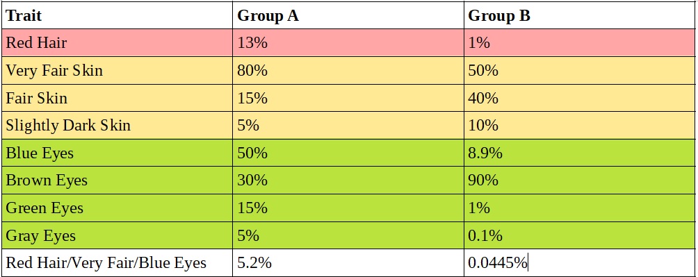
To make combining multiple traits or genes more concrete, let’s consider two groups (A and B) with different frequencies of common features. Group A is similar to the Irish, Scots, and Welsh with thirteen percent having red hair. Group A is more southern European with only one percent having red hair. The distributions of skin tone differ with Group A having eighty percent with very fair skin versus only fifty percent in Group B. Similarly blue eyes are much more common in Group A: fifty percent in group A and only 8.9 percent in group B. To make the analysis and computations simple, Groups A and B have the same number of members — one million.
For illustrative purposes only, we are assuming the traits are uncorrelated. In reality, red hair is correlated with very fair skin and freckles.
Estimating Group Membership from Multiple Traits
Using hair color alone, someone with red hair has a 13/(13+1=14) or 95.86% chance of belonging to group A. Using hair color, skin tone, and eye color, someone with red hair and very fair skin and blue eyes has a 5.2/(5.2+0.0445=5.2445) or 99.14% chance of belonging to group A.
Combining multiple traits (or genes and genetic markers) increases our confidence in the estimate of group membership but it cannot give an absolute definitive answer unless at least one trait (or gene or genetic marker) is unique to one group. This “barcode” trait or gene is a unique identifier for group membership.
Few genes or genetic markers have been identified that correlate strongly with our concepts of race, ethnicity, or nationality. One of the most well known and highly correlated examples is the Duffynull allele which is found in about ninety percent of Sub-Saharan Africans and is quite rare outside of Sub-Saharan Africa. The Duffy allele is thought to provide some resistance to vivax malaria.
Nonetheless, white people with no known African ancestry are sometimes encountered with the Duffy allele. This is often taken as indicating undocumented African ancestry, but we don’t really know. At least anecdotally, it is not uncommon for large surveys of European ancestry populations to turn up a few people with genes or genetic markers like the Duffy allele that are rare in Europe but common in Africa or Polynesia or other distant regions.
A More Realistic Example
The Duffy null allele and the variant M1CR gene that is supposed to be the cause of most red hair are unusually highly correlated with group membership. For illustrative purposes, let’s consider a model of combining multiple genes to identify group membership that may be more like the real situation.
Let’s consider a collection of one hundred genes. For example these could be genes that determine skin tone. Each gene has a light skin tone and a dark skin tone variant. The more dark skin tone variants someone has, the darker their skin tone. For bookkeeping we label the the light skin tone gene variants L1 through L100 and the dark skin tone genes variants D1 through D100.
Group A has a ten percent (1 in 10) chance of having the dark skin variant of each gene. On average, a member of group A has ninety (90) of the light skin tone variants and ten (10) of the dark skin variants. Group A may be somewhat like Northern Europeans.
Group B has a thirty percent (about 1 in 3) chance of having the dark skin variant of each gene. On average, a member of group B has seventy (70) of the light skin variants and thirty (30) of the dark skin variants. Group B may be somewhat like Mediterranean or some East Asian populations.
Notice that none of the gene variants is at all unique or nearly unique to either group. None of them acts like the M1CR variant associated with red hair, let alone the Duffy null allele. Nonetheless a genetic test can distinguish between membership in group A and group B with high confidence.
Group A versus Group B
Group A members have on average ten (10) dark skin variants with a standard deviation of three (3). This means ninety-five percent (95%) of Group A members will have between four (4) and sixteen (16) of the dark skin variant genes.
Group B members have on average thirty (30) dark skin variants with a standard deviation of about 4.6. This means about ninety-five percent (95%) of Group B members will have between twenty-one (21) and thirty-nine (39) dark skin variants.
In most cases, counting the number of dark skin variants that a person possesses will give over a ninety-five percent (95%) confidence level as to their group membership.
Someone with a parent from Group A and a parent from group B will fall smack in the middle, with an average of twenty (20) dark skin gene variants. Based on the genetic testing alone, they could be an unusually dark skinned member of Group A, an unusually light skinned member of Group B, or someone of mixed ancestry.
Someone with one grandparent from Group B and three grandparents from Group A would have fifteen (15) dark skin gene variants in their DNA, falling within two standard deviations of the Group A average. At least two percent (2%) of the members of Group A will have a darker skin tone than this person. Within just a few generations we lose the ability to detect Group B ancestry!
In the real world, each gene will have different variant frequencies, not ten percent versus thirty percent for every one, making the real world probability computations much more complicated.
The Out of Africa Hypothesis
The dominant hypothesis of human origins is that all humans are descended from an original population of early humans in Africa, where most early fossil remains of human and pre-human hominids have been found. According to this theory, the current populations in Europe, Asia, the Pacific Islands, and the Americas are descended from small populations that migrated out of Africa relatively recently in evolutionary terms — fifty-thousand to two-hundred thousand years ago depending on the variant of the theory. Not a lot of time for significant mutations to occur. Thus our ancestors may have started out with very similar frequencies of various traits, genes, and genetic markers. Selection pressures caused changes in the frequency of the genes (along with occasional mutations), notably selecting for lighter skin in northern climates.
Thus all races and groups may contain from very ancient times some people with traits, genes and genetic markers from Africa that have become more common in some regions and less common in other regions. Quite possibly the original founding populations included some members with the Duffy allele which increased in prevalence in Africa and remained rare or decreased in the other populations. Thus the presence of the Duffy allele or other rare genes or genetic markers does not necessarily indicate undocumented modern African ancestry — although it surely does in many cases.
Racially Identifying Characteristics Are Caused By Multiple Genes
The physical characteristics used to identify races such as skin tone, the extremely curly hair among most black Africans, and the epicanthic folds in East Asians (Orientals) that give the distinctive “slant” eyed appearance with the fold frequently covering the interior corner of the eye appear to be caused by multiple genes rather than a single “barcode” racial gene. Several genes work together to determine skin tone in ways that are not fully understood. Thus children of a light skinned parent and a dark skinned parent generally fall somewhere on the spectrum between the two skin tones.
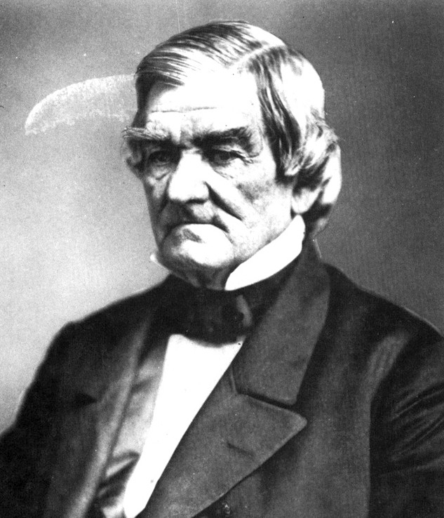
Racially identifying physical characteristics are subject to blending inheritance and generally dilute away with repeated intermixing with another race as is clearly visible in many American Indians with well documented heavy European ancestry as for example the famous Cherokee chief John Ross:
The Cherokee Chief John Ross (1790-1866)
Would a modern DNA ancestry test have correctly detected John Ross’s American Indian ancestry?
There are also many examples of people with recent East Asian ancestry who nonetheless look entirely or mostly European. These include the actresses Phoebe Cates (Chinese-Filipino grandfather), Meg Tilly (Margaret Elizabeth Chan, Chinese father), and Kristin Kreuk (Smallville, Chinese mother). Note that none of these examples has an epicanthic fold that cover the interior corner of the eyes. Especially since these are performers, the possibility of unreported cosmetic surgery cannot be ignored, but it is common for the folds to disappear or be greatly moderated in just one generation — no longer covering the interior corner of the eye for example.
How well do the DNA ancestry tests work for European looking people with well-documented East Asian ancestry, even a parent?
There are also examples of people with recent well-documented African, Afro-Carribean, or African-American ancestry who look very European. The best-selling author Malcolm Gladwell has an English father and a Jamaican mother. By his own account, his mother has some white ancestry. His hair is unusually curly and I suspect an expert in hair could distinguish it from unusually curly European hair.
In fact, some (not all) of the genes that cause racially identifying physical characteristics may be relatively “common” in other races, not extremely rare like the Duffy allele. For example, a few percent of Northern Europeans, particularly some Scandinavians, have folds around the eyes similar to East Asians, although the fully developed fold covering the interior corner of the eye is rare. Some people in Finland look remarkably Asian although they are generally distinguishable from true Asians. This is often attributed to Sami ancestry, although other theories include the Mongol invasions of the thirteenth century, the Hun invasions of the fifth century, other unknown migrations from the east, and captives brought back from North America or Central Asia by Viking raiders.
There is a lot of speculation on-line that Björk has Inuit ancestry and she has performed with Inuit musicians, but there appears to be no evidence of this. As noted above, a small minority of Scandinavians have epicanthic folds and other stereotypically Asian features.
The epicanthic fold is often thought to be an adaptation to the harsh northern climate with East Asians then migrating south into warmer regions. It is worth noting that the epicanthic fold and other “East Asian” eye features are found in some Africans. The “Out of Africa” explanation for milder forms of this feature in some northern Europeans is some early Europeans carried the traits with them from Africa and it was selected for in the harsh northern climate of Scandinavia and nearby regions, just as may have happened to a much greater extent in East Asia.
The critical point is that at present DNA ancestry tests — which are generally secret proprietary algorithms — are almost certainly using relative frequencies of various genes and genetic markers in different populations rather than a mythical genetic barcode that uniquely identifies the race, ethnicity, or nationality of the customer or his/her ancestors.
Hill Climbing Algorithms Can Give Unpredictable Results
In data analysis, it is common to use hill-climbing algorithms to “fit” models to data. A hill climbing algorithm starts at an educated or sometimes completely random guess as to the right result, searches nearby, and moves to the best result found in the neighborhood. It repeats the process until it reaches the top of a hill. It is not unlikely that some of the DNA ancestry tests are using hill climbing algorithms to find the “best” guess as to the ancestry/ethnicity of the customer.
Hill climbing algorithms can give unpredictable results depending both on the original guess and very minor variations (such as small differences between the DNA of identical twins). This can happen when the search starts near the midpoint of a valley between two hills. Should the algorithm go up one side (east) or up the other side of the valley (west)? A very small difference in the nearly flat valley floor can favor one side over the other, even though otherwise the situation is very very similar.
In DNA testing, east-west location might represent the fraction of European ancestry and the north-west location might represent the fraction of American Indian ancestry (for example). The height of the hill is measure of the goodness of fit between the model and the data (the genes and genetic markers in the DNA). Consider the difficulties that might arise discriminating between someone, mostly European, with a small amount of American Indian ancestry (say some of the genes that contribute to the epicanthic fold found in some American Indians) and someone who is entirely European but has a mild epicanthic fold and, in fact, some of the same genes. Two adjacent hills with a separating valley may appear — one representing all European and one representing Mostly European with a small mixture of American Indian.
This problem with hill climbing algorithms may explain the striking different results for two identical twins from the same DNA testing company reported by the CBC.
Other model fitting and statistical analysis methods can also exhibit unstable results in certain situations.
Again, the DNA ancestry tests are using the relative frequency of genes and genetic markers found in many groups, even in different races and on different continents, rather than a hypothetical group “barcode” gene that is a unique identifier.
Conclusion
It is reasonable to strongly suspect, given the many reports like the recent CBC news segment of variations in the estimated ancestry of several percent, that DNA ancestry tests for race, ethnicity, and nationality are not reliable at the few percent level (about 1/16, 6.25%, great-great-grandparent level) at present (Feb. 2019). Even where an unusual gene or genetic marker such as the Duffy null allele that is highly correlated with group membership is found in a customer, some caution is warranted as the “out of Africa” hypothesis suggests that many potential group “barcode” genes and markers will be present at low levels in all human populations.
It may be that the many reports of several percent errors in DNA ancestry tests are relatively rare compared to the millions of DNA ancestry tests now administered. Many DNA ancestry tests are “recreational” and occasional errors of several percent in such recreational cases are tolerable. Where DNA ancestry tests have serious implications, public policy or otherwise, much higher accuracy — as is claimed for forensic DNA tests and DNA paternity tests — is expected and should be required. Errors (e.g. ±0.5 percent) and/or confidence levels should be clearly stated and explained.
John F. McGowan, Ph.D. solves problems using mathematics and mathematical software, including developing gesture recognition for touch devices, video compression and speech recognition technologies. He has extensive experience developing software in C, C++, MATLAB, Python, Visual Basic and many other programming languages. He has been a Visiting Scholar at HP Labs developing computer vision algorithms and software for mobile devices. He has worked as a contractor at NASA Ames Research Center involved in the research and development of image and video processing algorithms and technology. He has published articles on the origin and evolution of life, the exploration of Mars (anticipating the discovery of methane on Mars), and cheap access to space. He has a Ph.D. in physics from the University of Illinois at Urbana-Champaign and a B.S. in physics from the California Institute of Technology (Caltech).
In July of last year, I wrote a review, “The Perils of Particle Physics,” of Sabine Hossenfelder’s book Lost in Math: How Beauty Leads Physics Astray (Basic Books, June 2018). Lost in Math is a critical account of the disappointing progress in fundamental physics, primarily particle physics and cosmology, since the formulation of the “standard model” in the 1970’s.
Lost in Math
Dr. Hossenfelder has followed up her book with an editorial “The Uncertain Future of Particle Physics” in The New York Times (January 23, 2019) questioning the wisdom of funding CERN’s recent proposal to build a new particle accelerator, the Future Circular Collider (FCC), estimated to cost over $10 billion. The editorial has in turn produced the predictable howls of outrage from particle physicists and their allies:
My original review of Lost in Math covers many points relevant to the editorial. A few additional comments related to particle accelerators:
Particle physics is heavily influenced by the ancient idea of atoms (found in Plato’s Timaeus about 360 B.C. for example) — that matter is comprised of tiny fundamental building blocks, also known as particles. The idea of atoms proved fruitful in understanding chemistry and other phenomena in the 19th century and early 20th century.
In due course, experiments with radioactive materials and early precursors of today’s particle accelerators were seemingly able to break the atoms of chemistry into smaller building blocks: electrons and the atomic nucleus comprised of protons and neutrons, presumably held together by exchanges of mesons such as the pion. The main flaw in the building block model of chemical atoms was the evident “quantum” behavior of electrons and photons (light), the mysterious wave-particle duality quite unlike the behavior of macroscopic particles like billiard balls.
Given this success, it was natural to try to break the protons, neutrons and electrons into even smaller building blocks. This required and justified much larger, more powerful, and increasingly more expensive particle accelerators.
The problem or potential problem is that this approach never actually broke the sub-atomic particles into smaller building blocks. The electron seems to be a point “particle” that clearly exhibits puzzling quantum behavior unlike any macroscopic particle from tiny grains of sand to giant planets.
The proton and neutron never shattered into constituents even though they are clearly not point particles. They seem more like small blobs or vibrating strings of fluid or elastic material. Pumping more energy into them in particle accelerators simply produced more exotic particles, a puzzling sub-atomic zoo. This led to theories like nuclear democracy and Regge poles that interpreted the strongly (strong here referring to the strong nuclear force that binds the nucleus together and powers both the Sun and nuclear weapons) interacting particles as vibrating strings of some sort. The plethora of mesons and baryons were explained as excited states of these strings — of low energy “particles” such as the neutron, proton, and the pion.
However, some of the experiments observed electrons scattering off protons (the nucleus of the most common type of hydrogen atom is a single proton) at sharp angles as if the electron had hit a small “hard” charged particle, not unlike an electron. These partons were eventually interpreted as the quarks of the reigning ‘standard model’ of particle physics.
Unlike the proton, neutron, and electron in chemical atoms, the quarks have never been successfully isolated or extracted from the sub-nuclear particles such as the proton or neutron. This eventually led to theories that the force between the quarks grows stronger with increasing distance, mediated by some sort of string-like tube of field lines (for lack of better terminology) that never breaks however far it is stretched.
Particles All the Way Down
There is an old joke regarding the theory of a flat Earth. The Earth is supported on the back of a turtle. The turtle in turn is supported on the back of a bigger turtle. That turtle stands on the back of a third turtle and so on. It is “Turtles all the way down.” This phrase is shorthand for a problem of infinite regress.
For particle physicists, it is “particles all the way down”. Each new layer of particles is presumably composed of smaller still particles. Chemical atoms were comprised of protons and neutrons in the nucleus and orbiting (sort of) electrons. Protons and neutrons are composed of quarks, although we can never isolate them. Arguably the quarks are constructed from something smaller, although the favored theories like supersymmetry have gone off in hard to understand multidimensional directions.
“Particles all the way down” provides an intuitive justification for building every larger, more powerful, and expensive particle accelerators and colliders to repeat the success of the atomic theory of matter and radioactive elements at finer and finer scales.
However, there are other ways to look at the data. Namely, the strongly interacting particles — the neutron, the proton, and the mesons like the pion — are some sort of vibrating quantum mechanical “strings” of a vaguely elastic material. Pumping more energy into them through particle collisions produces excitations — various sorts of vibrations, rotations, and kinks or turbulent eddies in the strings.
The kinks or turbulent eddies act as small localized scattering centers that can never be extracted independently from the strings — just like quarks.
In this interpretation, strongly interacting particles such as the proton and possibly weakly (weak referring to the weak nuclear force responsible for many radioactive decays such as the carbon-14 decay used in radiocarbon dating) interacting seeming point particles like the electron are comprised of a primal material.
In this latter case, ever more powerful accelerators will only create ever more complex excitations — vibrations, rotations, kinks, turbulence, etc. — in the primal material. These excitations are not building blocks of matter that give fundamental insight.
One needs rather to find the possible mathematics describing this primal material. Perhaps a modified wave equation with non-linear terms for a viscous fluid or quasi-fluid. Einstein, deBroglie, and Schrodinger were looking at something like this to explain and derive quantum mechanics and put the pilot wave theory of quantum mechanics on a deeper basis.
A critical problem is that an infinity of possible modified wave equations exist. At present it remains a manual process to formulate such equations and test them against existing data — a lengthy trial and error process to find a specific modified wave equation that is correct.
This is a problem shared with mainstream approaches such as supersymmetry, hidden dimensions, and so forth. Even with thousands of theoretical physicists today, it is time consuming and perhaps intractable to search the infinite space of possible mathematics and find a good match to reality. This is the problem that we are addressing at Mathematical Software with our Math Recognition technology.
(C) 2019 by John F. McGowan, Ph.D.
About Me
John F. McGowan, Ph.D. solves problems using mathematics and mathematical software, including developing gesture recognition for touch devices, video compression and speech recognition technologies. He has extensive experience developing software in C, C++, MATLAB, Python, Visual Basic and many other programming languages. He has been a Visiting Scholar at HP Labs developing computer vision algorithms and software for mobile devices. He has worked as a contractor at NASA Ames Research Center involved in the research and development of image and video processing algorithms and technology. He has published articles on the origin and evolution of life, the exploration of Mars (anticipating the discovery of methane on Mars), and cheap access to space. He has a Ph.D. in physics from the University of Illinois at Urbana-Champaign and a B.S. in physics from the California Institute of Technology (Caltech).
How to Tell Scientifically if Advertising Works Explainer Video
[Slide 1]
“Half the money
I spend on advertising is wasted; the trouble is I don’t know which
half.”
This popular quote
sums up the problem with advertising.
[Slide 2]
There are many
advertising choices today including not advertising, relying on word
of mouth and other “organic” growth. Is the advertising
working?
[Slide 3]
Proxy measures such
as link clicks can be highly misleading. A bad advertisement can get
many clicks, even likes but reduce sales by making the product look
bad in an entertaining way.
[Animation Enter]
[Wait 2 seconds]
[Slide 4]
Did the advertising
increase sales and profits? This requires analysis of the product
sales and advertising expenses from your accounting program such as
QuickBooks. Raw sales reports are often difficult to interpret
unless the boost in sales is extremely large such as doubling sales.
Sales are random like flipping a coin. This means a small but
profitable increase such as twenty percent is often difficult to
distinguish from chance alone.
[Slide 5]
Statistical analysis
and computer simulation of a business can give a quantitative,
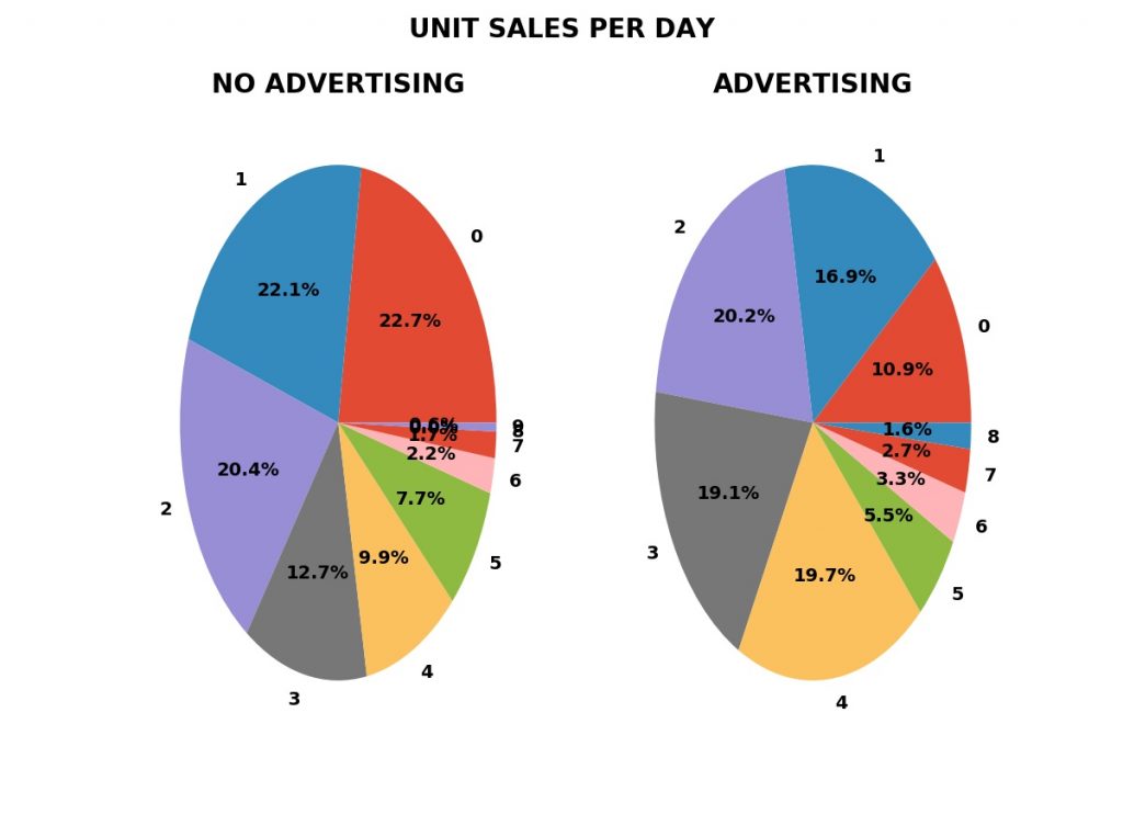
PREDICTIVE answer. We can measure the fraction of days with zero,
one, two, or more unit sales with advertising — the green bars in
the plot shown — and without advertising, the blue bars.
[Slide 6]
With these
fractions, we can simulate the business with and without advertising.
The bar chart shows
the results for one thousand simulations of a year of business
operations. Because sales are random like flipping a coin, there
will be variations in profit from simulation to simulation due to
chance alone.
The horizontal axis
shows the change in profits in the simulation compared to the actual
sales without advertising. The height of the bars shows the FRACTION
of the simulations with the change in profits on the horizontal axis.
The blue bars are
the fractions for one-thousand simulations without advertising.
[Animation Enter]
The green bars are
the fractions for one-thousand simulations with advertising.
[Animation Enter]
The vertical red bar
shows the average change in profits over ALL the simulations WITH THE
ADVERTISING.
There is ALWAYS an
increased risk from the fixed cost of the advertising — $500 per
month, $6,000 per year in this example. The green bars in the lower
left corner show the increased risk with advertising compared to the
blue bars without advertising.
If the advertising
campaign increases profits on average and we can afford the increased
risk, we should continue the advertising.
[Slide 7]
This analysis was
performed with Mathematical Software’s AdEvaluator Free Open Source
Software. AdEvaluator works for sales data where there is a SINGLE
change in the business, a new advertising campaign.
Our AdEvaluator Pro
software for which we will charge money will evaluate cases with
multiple changes such as a price change and a new advertising
campaign overlapping.
Click on the
Downloads TAB for our Downloads page.
[Web Site Animation
Exit]
[Download Links
Animation Entrance]
AdEvaluator can be
downloaded from GitHub or as a ZIP file directly from the downloads
page on our web site.
[Download Links
Animation Exit]
Or scan this QR code
to go to the Downloads page.
This is John F.
McGowan, Ph.D., CEO of Mathematical Software. I have many years
experience solving problems using mathematics and mathematical
software including work for Apple, HP Labs, and NASA. I can be
reached at ceo@mathematical-software.com
John F. McGowan, Ph.D. solves problems using mathematics and mathematical software, including developing gesture recognition for touch devices, video compression and speech recognition technologies. He has extensive experience developing software in C, C++, MATLAB, Python, Visual Basic and many other programming languages. He has been a Visiting Scholar at HP Labs developing computer vision algorithms and software for mobile devices. He has worked as a contractor at NASA Ames Research Center involved in the research and development of image and video processing algorithms and technology. He has published articles on the origin and evolution of life, the exploration of Mars (anticipating the discovery of methane on Mars), and cheap access to space. He has a Ph.D. in physics from the University of Illinois at Urbana-Champaign and a B.S. in physics from the California Institute of Technology (Caltech).
AdEvaluator™ evaluates the effect of advertising (or marketing, sales, or public relations) on sales and profits by analyzing a sales report in comma separated values (CSV) format from QuickBooks or other accounting programs. It requires a reference period without the advertising and a test period with the advertising. The advertising should be the only change between the two periods. There are some additional limitations explained in the on-line help for the program.
(C) 2019 by John F. McGowan, Ph.D.
About Me
John F. McGowan, Ph.D. solves problems using mathematics and mathematical software, including developing gesture recognition for touch devices, video compression and speech recognition technologies. He has extensive experience developing software in C, C++, MATLAB, Python, Visual Basic and many other programming languages. He has been a Visiting Scholar at HP Labs developing computer vision algorithms and software for mobile devices. He has worked as a contractor at NASA Ames Research Center involved in the research and development of image and video processing algorithms and technology. He has published articles on the origin and evolution of life, the exploration of Mars (anticipating the discovery of methane on Mars), and cheap access to space. He has a Ph.D. in physics from the University of Illinois at Urbana-Champaign and a B.S. in physics from the California Institute of Technology (Caltech).
How to Tell Scientifically if Advertising Boosts Profits Video
Short (seven and one half minute) video showing how to evaluate scientifically if advertising boosts profits using mathematical modeling and statistics with a pitch for our free open source AdEvaluator™ software and a teaser for our non-free AdEvaluator Pro™software — coming soon.
John F. McGowan, Ph.D. solves problems using mathematics and mathematical software, including developing gesture recognition for touch devices, video compression and speech recognition technologies. He has extensive experience developing software in C, C++, MATLAB, Python, Visual Basic and many other programming languages. He has been a Visiting Scholar at HP Labs developing computer vision algorithms and software for mobile devices. He has worked as a contractor at NASA Ames Research Center involved in the research and development of image and video processing algorithms and technology. He has published articles on the origin and evolution of life, the exploration of Mars (anticipating the discovery of methane on Mars), and cheap access to space. He has a Ph.D. in physics from the University of Illinois at Urbana-Champaign and a B.S. in physics from the California Institute of Technology (Caltech).
John F. McGowan, Ph.D. solves problems using mathematics and mathematical software, including developing gesture recognition for touch devices, video compression and speech recognition technologies. He has extensive experience developing software in C, C++, MATLAB, Python, Visual Basic and many other programming languages. He has been a Visiting Scholar at HP Labs developing computer vision algorithms and software for mobile devices. He has worked as a contractor at NASA Ames Research Center involved in the research and development of image and video processing algorithms and technology. He has published articles on the origin and evolution of life, the exploration of Mars (anticipating the discovery of methane on Mars), and cheap access to space. He has a Ph.D. in physics from the University of Illinois at Urbana-Champaign and a B.S. in physics from the California Institute of Technology (Caltech).
John Wanamaker, (attributed) US department store merchant (1838 – 1922)
Between $190 billion and $270 billion is spent on advertising in the United States each year (depending on source). It is often hard to tell whether the advertising boosts sales and profits. This is caused by the unpredictability of individual sales and in many cases the other changes in the business and business environment occurring in addition to the advertising. In technical terms, the evaluation of the effect of advertising on sales and profits is often a multidimensional problem.
Many common metrics such as the number of views, click through rates (CTR), and others do not directly measure the change in sales or profits. For example, an embarrassing or controversial video can generate large numbers of views, shares, and even likes on a social media site and yet cause a sizable fall in sales and profits.
Because individual sales are unpredictable, it is often difficult or impossible to tell whether a change in sales is caused by advertising, simply due to chance alone or some combination of advertising and luck.
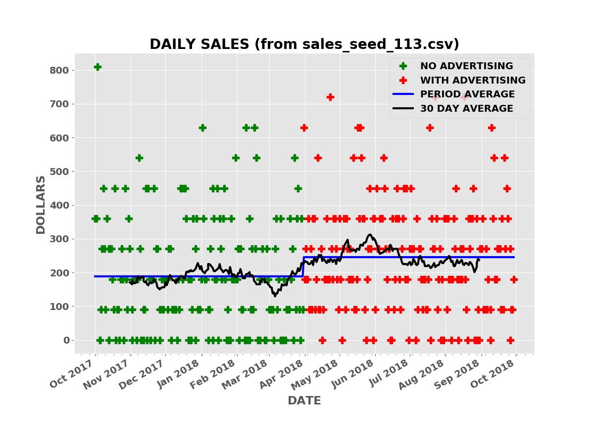
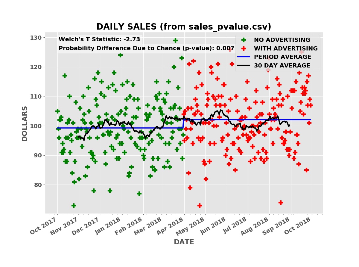
The plot below shows the simulated daily sales for a product or service with a price of $90.00 per unit. Initially, the business has no advertising, relying on word of mouth and other methods to acquire and retain customers. During this “no advertising” period, an average of three units are sold per day. The business then contracts with an advertising service such as Facebook, Google AdWords, Yelp, etc. During this “advertising” period, an average of three and one half units are sold per day.
Daily Sales
The raw daily sales data is impossible to interpret. Even looking at the thirty day moving average of daily sales (the black line), it is far from clear that the advertising campaign is boosting sales.
Taking the average daily sales over the “no advertising” period, the first six months, and over the “advertising” period (the blue line), the average daily sales was higher during the advertising period.
Is the increase in sales due to the advertising or random chance or some combination of the two causes? There is always a possibility that the sales increase is simply due to chance. How much confidence can we have that the increase in sales is due to the advertising and not chance?
This is where statistical methods such as Student’s T test, Welch’s T test, mathematical modeling and computer simulations are needed. These methods compute the effectiveness of the advertising in quantitative terms. These quantitative measures can be converted to estimates of future sales and profits, risks and potential rewards, in dollar terms.
Measuring the Difference Between Two Random Data Sets
In most cases, individual sales are random events like the outcome of flipping a coin. Telling whether sales data with and without advertising is the same is similar to evaluating whether two coins have the same chances of heads and tails. A “fair” coin is a coin with an equal chance of giving a head or a tail when flipped. An “unfair” coin might have a three fourths chance of giving a head and only a one quarter chance of giving a tail when flipped.
If I flip each coin once, I cannot tell the difference between the fair coin and the unfair coin. If I flip the two coins ten times, on average I will get five heads from the fair coin and seven and one half (seven or eight) heads from the unfair coin. It is still hard to tell the difference. With one hundred times, the fair coin will average fifty heads and the unfair coin seventy-five heads. There is still a small chance that the seventy five heads came from a fair coin.
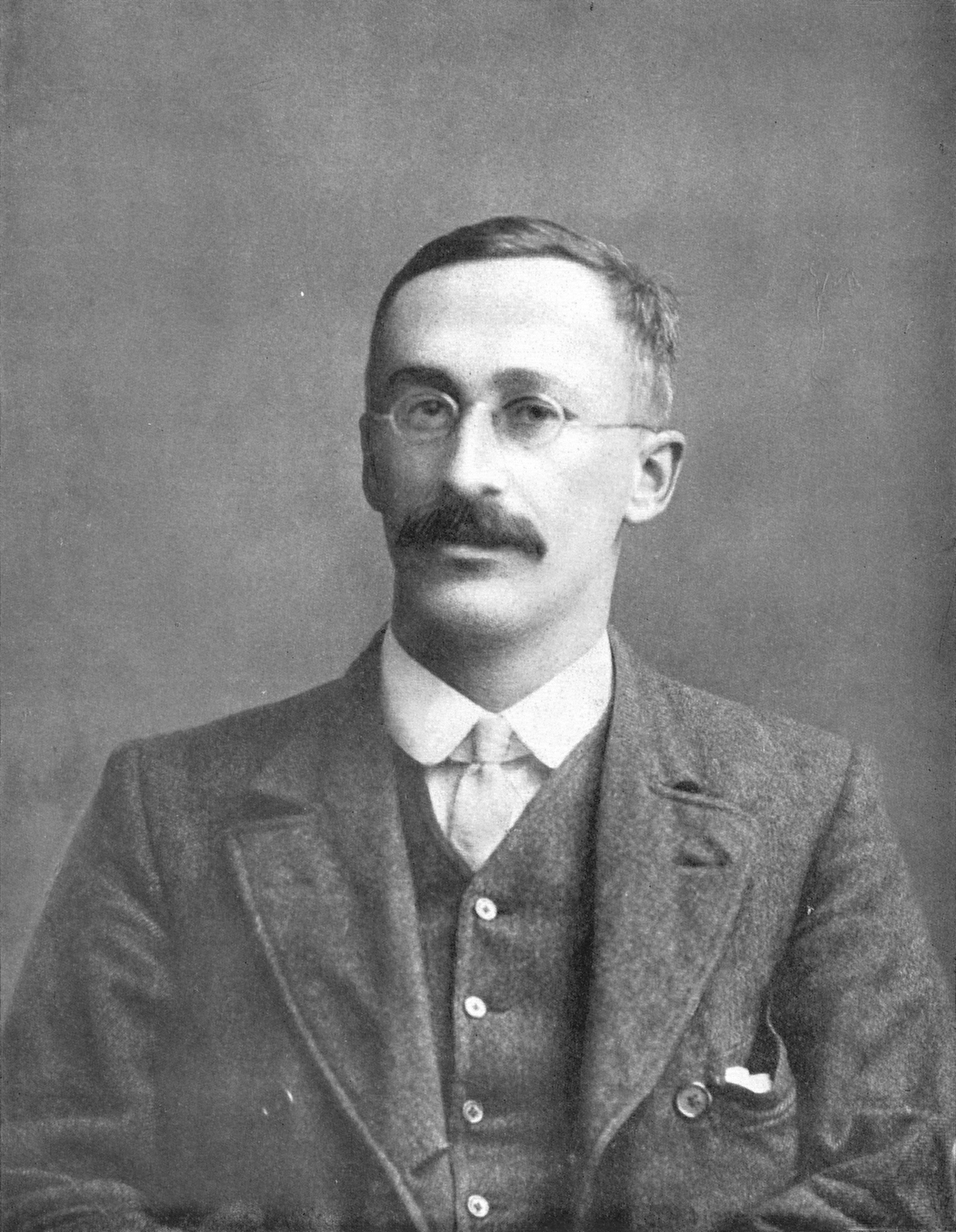
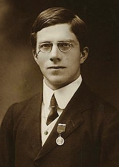
The T statistics used in Student’s T test (Student was a pseudonym used by statistician William Sealy Gossett) and Welch’s T test, a more advanced T test, are measures of the difference in a statistical sense between two random data sets, such as the outcome of flipping coins one hundred times. The larger the T statistic the more different the two random data sets in a statistical sense.
William Sealy Gossett (Student)
Student’s T test and Welch’s T test convert the T statistics into probabilities that the difference between the two data sets (the “no advertising” and “advertising” sales data in our case) is due to chance. Student’s T test and Welch’s T test are included in Excel and many other financial and statistical programs.
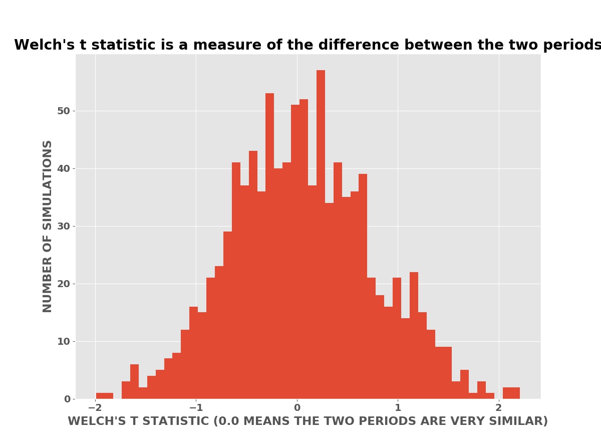
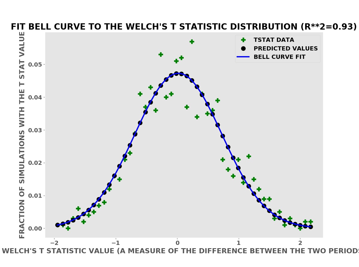
The plot below is a histogram (bar chart) of the number of simulations with a Welch’s T statistic value. In these simulations, the advertising has no effect on the daily sales (or profits). The advertising has no effect is the null hypothesis in the language of classical statistics.
Welch’s T Statistics
Welch was able to derive a mathematical formula for the expected distribution — shape of this histogram — using calculus. The mathematical formula could then be evaluated quickly with pencil and paper or an adding machine, the best available technology of his time (the 1940’s).
To derive his formula using calculus, Welch had to assume that the data had a Bell Curve (Normal or Gaussian) distribution. This is at best only approximately true for the sales data above. The distribution of daily sales in the simulated data is actually the Poisson distribution. The Poisson distribution is a better model of sales data and approximates the Bell Curve as the number of sales gets larger. This is why Welch’s T test is often approximately valid for sales data.
Many methods and tests in classical statistics assume a Bell Curve (Normal or Gaussian) distribution and are often approximately correct for real data that is not Bell Curve data. We can compute better, more reliable results with computer simulations using the actual or empirical probability distributions — shown below.
Welch’s T Statistic has Bell Curve Shape
More precisely, naming one data set the reference data and the other data set the test data, the T test computes the probability that the test data is due to a chance variation in the process that produced the reference data set. In the advertising example above, the “no advertising” period sales data is the reference data and the “advertising” sales data is the test data. Roughly this probability is the fraction of simulations in the Welch’s T statistic histogram that have a T statistic larger (or smaller for a negative T statistic) than the measured T statistic for the actual data. This probability is known as a p-value, a widely used statistic pioneered by Ronald Fisher.
Ronald Aylmer Fisher at the start of his career
The p-value has some obvious drawbacks for a business evaluating the effectiveness of advertising. At best it only tells us the probability that the advertising boosted sales or profits, not how large the boost was nor the risks. Even if on average the advertising boosts sales, what is the risk the advertising will fail or the sales increase will be too small to recover the cost of the advertising?
Fisher worked for Rothamsted Experimental Station in the United Kingdom where he wanted to know whether new breeds of crops, fertilizers, or other new agricultural methods increased yields. His friend and colleague Gossett worked for the Guinness beer company where he was working on improving yields and quality of beer. In both cases, they wanted to know whether a change in the process had a positive effect, not the size of the effect. Without modern computers — using only pencil and paper and adding machines — it was not practical to perform simulations as we can easily today.
Welch’s T statistic has a value of -3.28 for the above sales data. This is in fact lower than nearly all the simulations in the histogram. It is very unlikely the boost in sales is due to chance. The p-value from Welch’s T test for the advertising data above — computed using Welch’s mathematical formula — is only 0.001 (one tenth of one percent). Thus it is very likely the boost in sales is caused by the advertising and not random chance. Note that this does not tell us if the size of the boost, whether the advertising is cost effective, or the risk of the investment.
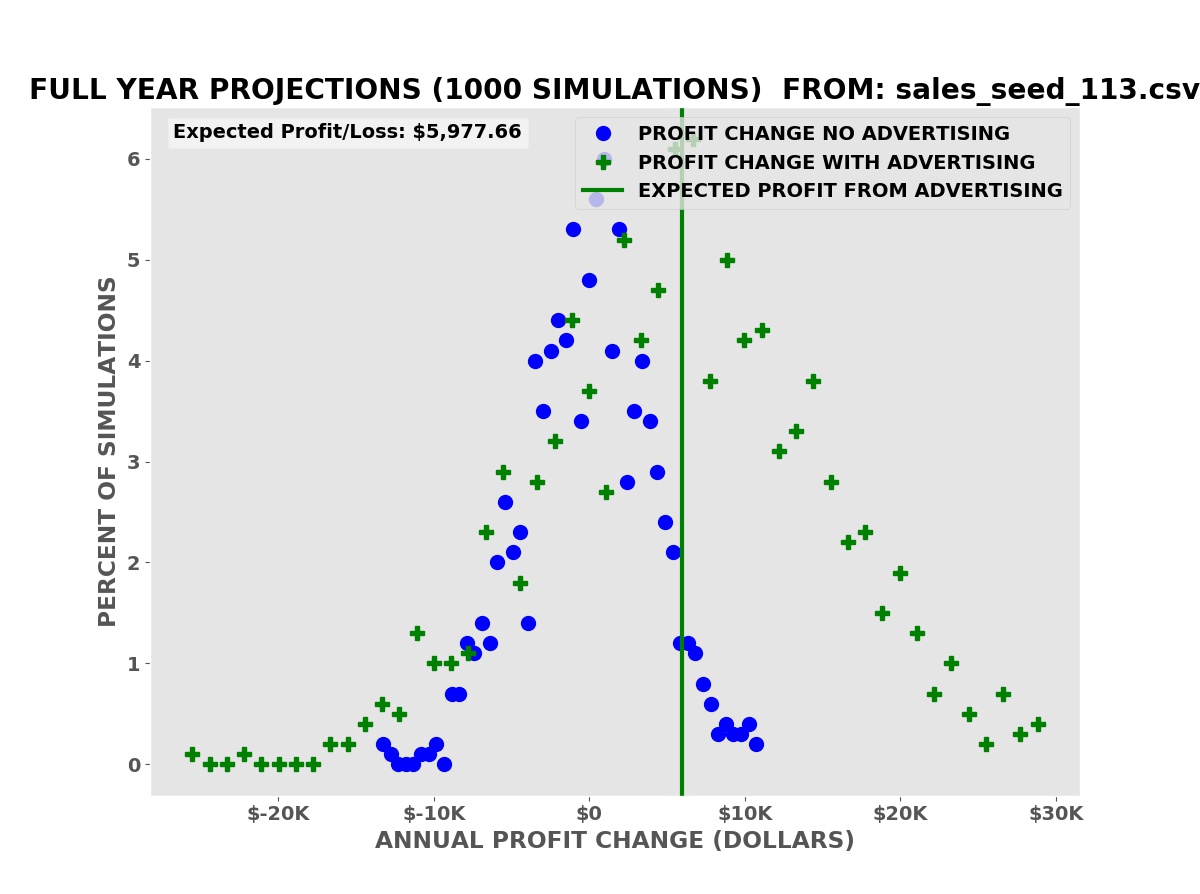
Sales and Profit Projections Using Computer Simulations
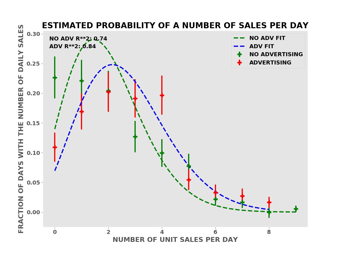
We can do much better than Student’s T test and Welch’s T test by using computer simulations based on the empirical probabilities of sales from the reference data — the “no advertising” period sales data. The simulations use random number generators to simulate the random nature of individual sales.
In these simulations, we simulate one year of business operations with advertising many times — one-thousand in the examples shown — using the frequency of sales from the period with advertising. We also simulate one year of business operations without the advertising, using the frequency of sales from the period without advertising in the sales data.
Frequency of Daily Sales in Both Periods
We compute the annual change in the profit relative to the corresponding period — with or without advertising — in the sales data for each simulated year of business operations.
Annual Profit Projections
The simulations show that we have an average expected increase in profit of $5,977.66 over one year (our annual advertising cost is $6,000.00). It also shows that despite this there is a risk of a decrease in profits, some greater than the possible decreases with no advertising.
A business needs to know both the risks — how much money might be lost in a worst case — and the rewards — the average and best possible returns on the advertising investment.
Since sales are a random process like flipping a coin or throwing dice, there is a risk of a decline in profits or actual losses without the advertising. The question is whether the risk with advertising is greater, smaller, or the same. This is known as differential risk.
The Problem with p-values
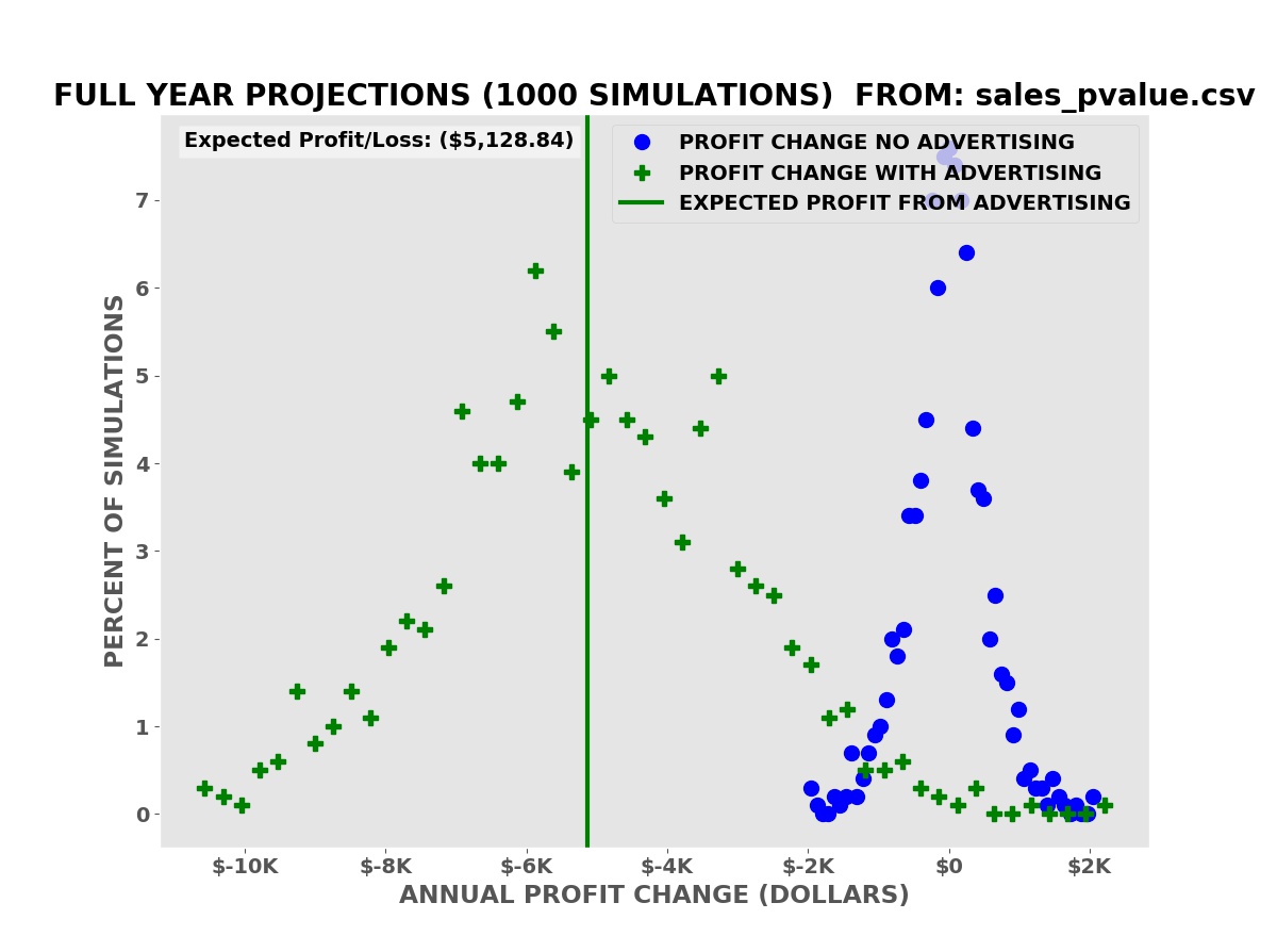
This is a concrete example of the problem with p-values for evaluating the effectiveness of advertising. In this case, the advertising increases the average daily sales from 100 units per day to 101 units per day. Each unit costs one dollar (a candy bar for example).
P-VALUE SHOWS BOOST IN SALES
The p-value from Welch’s T test is 0.007 (seven tenths of one percent). The advertising is almost certainly effective but the boost in sales is much less than the cost of the advertising:
Profit Projections
The average expected decline in profits over the simulations is $5,128.84.
The p-value is not a good estimate of the potential risks and rewards of investing in advertising. Sales and profit projections from computer simulations based on a mathematical model derived from the reference sales data are a better (not perfect) estimate of the risks and rewards.
Multidimensional Sales Data
The above examples are simple cases where the only change is the addition of the advertising. There are no price changes, other advertising or marketing expenses, or other changes in business or economic conditions. There are no seasonal effects in the sales.
Student’s T test, Welch’s T test, and many other statistical tests are designed and valid only for simple controlled cases such as this where there is only one change between the reference and test data. These tests were well suited to data collected at the Rothamsted Experimental Station, Guinness breweries, and similar operations.
Modern businesses purchasing advertising from Facebook, other social media services, and modern media providers (e.g. the New York Times) face more complex conditions with many possible input variables (unit price, weather, unemployment rate, multiple advertising services, etc.) changing frequently or continuously.
For these, financial analysts need to extract predictive multidimensional mathematical models from the data and then perform similar simulations to evaluate the effect of advertising on sales and profits.
AdEvaluator™ is designed for cases with a single product or service with a constant unit price during both periods. AdEvaluator™ needs a reference period without the new advertising and a test period with the new advertising campaign. The new advertising campaign should be the only significant change between the two periods. AdEvaluator™ also assumes that the probability of the daily sales is independent and identically distributed during each period. This is not true in all cases. Exercise your professional business judgement whether the results of the simulations are applicable to your business.
This program comes with ABSOLUTELY NO WARRANTY; for details use -license option at the command line or select Help | License… in the graphical user interface (GUI). This is free software, and you are welcome to redistribute it under certain conditions.
We are developing a professional version of AdEvaluator™ for multidimensional cases. This version uses our Math Recognition™ technology to automatically identify good multidimensional mathematical models.
The Math Recognition™ technology is applicable to many types of data, not just sales and advertising data. It can for example be applied to complex biological systems such as the blood coagulation system which causes heart attacks and strokes when it fails. According the US Centers for Disease Control (CDC) about 633,000 people died from heart attacks and 140,000 from strokes in 2016.
Conclusion
It is often difficult to evaluate whether advertising is boosting sales and profits, despite the ready availability of sales and profit data for most businesses. This is caused by the unpredictable nature of individual sales and frequently by the complex multidimensional business environment where price changes, economic downturns and upturns, the weather, and other factors combine with the advertising to produce a confusing picture.
In simple cases with a single change, the addition of the new advertising, Student’s T test, Welch’s T test and other methods from classical statistics can help evaluate the effect of the advertising on sales and profits. These statistical tests can detect an effect but provide no clear estimate of the magnitude of the effect on sales and profits and the financial risks and rewards.
Sales and profit projections based on computer simulations using the empirical probability of sales from the actual sales data can provide quantitative estimates of the effect on sales and profits, including estimates of the financial risks (chance of losing money) and the financial rewards (typical and best case profits).
(C) 2018 by John F. McGowan, Ph.D.
About Me
John F. McGowan, Ph.D. solves problems using mathematics and mathematical software, including developing gesture recognition for touch devices, video compression and speech recognition technologies. He has extensive experience developing software in C, C++, MATLAB, Python, Visual Basic and many other programming languages. He has been a Visiting Scholar at HP Labs developing computer vision algorithms and software for mobile devices. He has worked as a contractor at NASA Ames Research Center involved in the research and development of image and video processing algorithms and technology. He has published articles on the origin and evolution of life, the exploration of Mars (anticipating the discovery of methane on Mars), and cheap access to space. He has a Ph.D. in physics from the University of Illinois at Urbana-Champaign and a B.S. in physics from the California Institute of Technology (Caltech).
It is common to encounter claims of a “desperate” or “severe” shortage of STEM (Science, Technology, Engineering, and Mathematics) workers, either current or projected, usually from employers of STEM workers. These claims are perennial and date back at least to the 1940’s after World War II despite the huge number of STEM workers employed in wartime STEM projects (the Manhattan Project that developed the atomic bomb, military radar, code breaking machines and computers, the B-29 and other high tech bombers, the development of penicillin, K-rations, etc.). This article takes a look at the STEM degree numbers in the National Science Foundation’s Science and Engineering Indicators 2018 report.
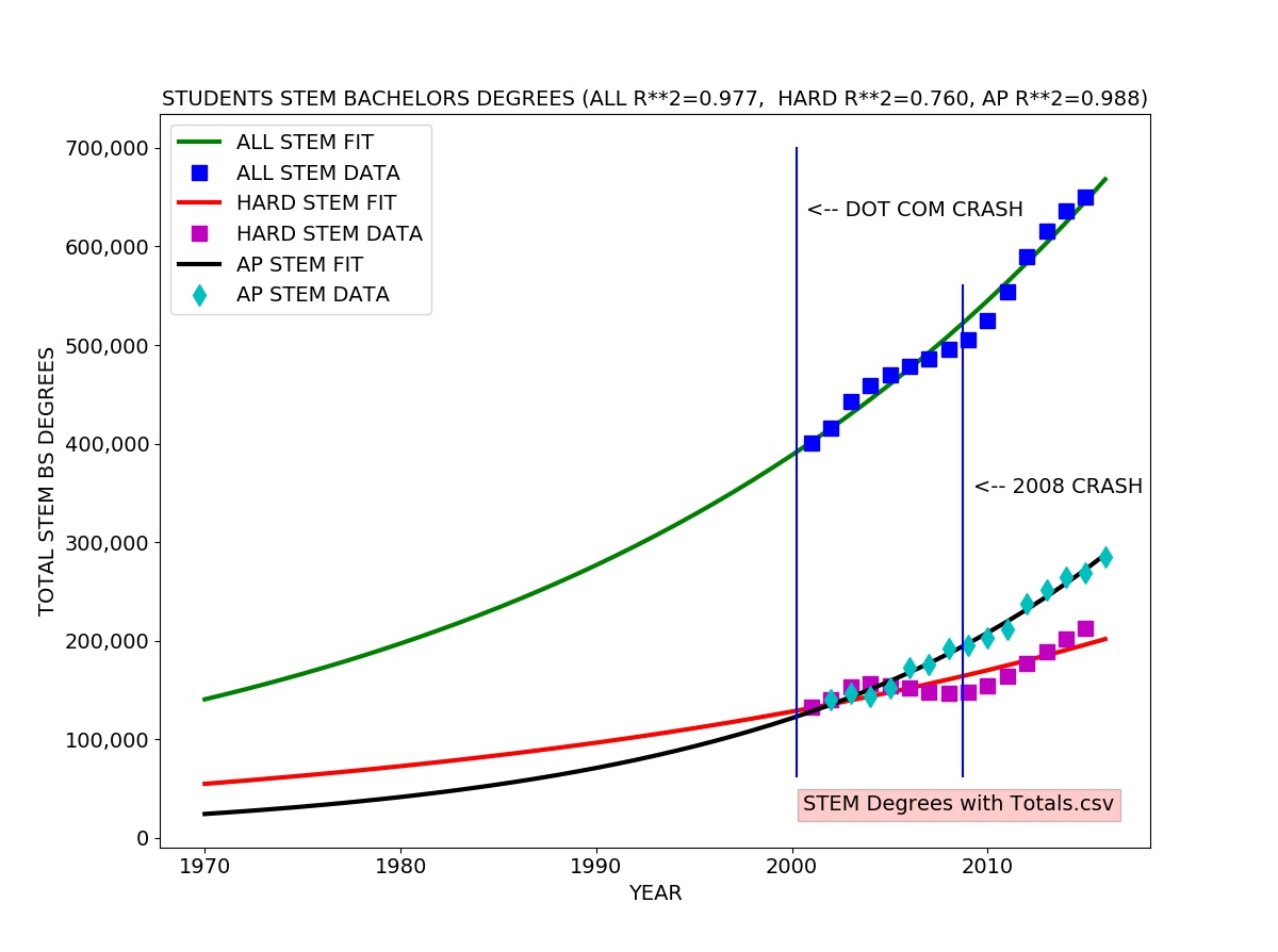
College STEM Degrees (NSF Science and Engineering Indicators 2018)
I looked at the total Science and Engineering bachelors degrees granted each year which includes degrees in Social Science, Psychology, Biological and agricultural sciences as well as hard core Engineering, Computer Science, Mathematics, and Physical Sciences. I also looked specifically at the totals for “hard” STEM degrees (Engineering, Computer Science, Mathematics, and Physical Sciences). I also included the total number of K-12 students who pass (score 3,4, or 5 out of 5) on the Advanced Placement (AP) Calculus Exam (either the AB exam or the more advanced BC exam) each year.
I fitted an exponential growth model to each data series. The exponential growth model fits well to the total STEM degrees and AP passing data. The exponential growth model roughly agrees with the hard STEM degree data, but there is a clear difference, reflected in the coefficient of determination (R-SQUARED) of 0.76 meaning the model explains about 76 percent of the variation in the data.
One can easily see the the number of hard STEM degrees significantly exceeds the trend line in the early 00’s (2000 to about 2004) and drops well below from 2004 to 2008, rebounding in 2008. This probably reflects the surge in CS degrees specifically due to the Internet/dot com bubble (1995-2001).
There appears to be a lag of about four years between the actual dot com crash usually dated to a stock market drop in March of 2000 and the drop in production of STEM bachelor’s degrees in about 2004.
Analysis results:
TOTAL Scientists and Engineers 2016: 6,900,000

ALL STEM Bachelor's Degrees
ESTIMATED TOTAL IN 2016 SINCE 1970: 15,970,052
TOTAL FROM 2001 to 2015 (Science and Engineering Indicators 2018)  7,724,850
ESTIMATED FUTURE STUDENTS (2016 to 2026): 8,758,536
ANNUAL GROWTH RATE:  3.45 %  US POPULATION GROWTH RATE (2016): 0.7 %

HARD STEM DEGREES ONLY (Engineering, Physical Sciences, Math, CS)
ESTIMATED TOTAL IN 2016 SINCE 1970: 5,309,239
TOTAL FROM 2001 to 2015 (Science and Engineering Indicators 2018)  2,429,300
ESTIMATED FUTURE STUDENTS (2016 to 2026): 2,565,802
ANNUAL GROWTH RATE:  2.88 %  US POPULATION GROWTH RATE (2016): 0.7 %

STUDENTS PASSING AP CALCULUS EXAM
ESTIMATED TOTAL IN 2016 SINCE 1970: 5,045,848
TOTAL FROM 2002 to 2016  (College Board)  3,038,279
ESTIMATED FUTURE STUDENTS (2016 to 2026): 4,199,602
ANNUAL GROWTH RATE:  5.53 %  US POPULATION GROWTH RATE (2016): 0.7 %
estimate_college_stem.py ALL DONE
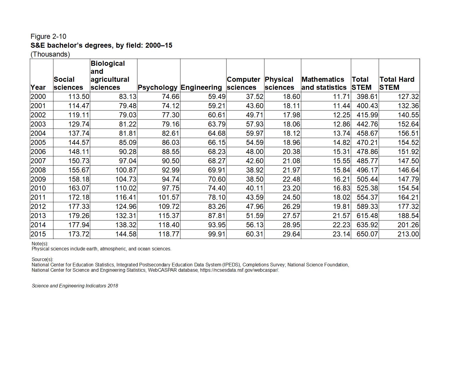
The table below gives the raw numbers from Figure 02-10 in the NSF Science and Engineering Indicators 2018 report with a column for total STEM degrees and a column for total STEM degrees in hard science and technology subjects (Engineering, Computer Science, Mathematics, and Physical Sciences) added for clarity:
STEM Degrees Table fig02-10 Revised
In the raw numbers, we see steady growth in social science and psychology STEM degrees from 2000 to 2015 with no obvious sign of the Internet/dot com bubble. There is a slight drop in Biological and agricultural sciences degrees in the early 00s. Somewhat larger drops can be seen in Engineering and Physical Sciences degrees in the early 00’s as well as a concomittant sharp rise in Computer Science (CS) degrees. This probably reflects strong STEM students shifting into CS degrees.
The number of K-12 students taking and passing the AP Calculus Exam (either the AB or more advanced BC exam) grows continuously and rapidly during the entire period from 1997 to 2016, growing at over five percent per year, far above the United States population growth rate of 0.7 percent per year.
The number of college students earning hard STEM degrees appears to be slightly smaller than the four year lagged number of K-12 students passing the AP exam, suggesting some attrition of strong STEM students at the college level. We might expect the number of hard STEM bachelors degrees granted each year to be the same or very close to the number of AP Exam passing students four years earlier.
A model using only the hard STEM bachelors degree students gives a total number of STEM college students produced since 1970 of five million, pretty close to the number of K-12 students estimated from the AP Calculus exam data. This is somewhat less than the 6.9 million total employed STEM workers estimated by the United States Bureau of Labor Statistics.
Including all STEM degrees gives a huge surplus of STEM students/workers, most not employed in a STEM field as reported by the US Census and numerous media reports.
The hard STEM degree model predicts about 2.5 million new STEM workers graduating between 2016 and 2026. This is slightly more than the number of STEM job openings seemingly predicted by the Bureau of Labor Statistics (about 800,000 new STEM jobs and about 1.5 million retirements and deaths of current aging STEM workers giving a total of about 2.3 million “new” jobs). The AP student model predicts about 4 million new STEM workers, far exceeding the BLS predictions and most other STEM employment predictions.
The data and models do not include the effects of immigration and guest worker programs such as the controversial H1-B visa, L1 visa, OPT visa, and O (“Genius”) visa. Immigrants and guest workers play an outsized role in the STEM labor force and specifically in the computer science/software labor force (estimated at 3-4 million workers, over half of the STEM labor force).
Difficulty of Evaluating “Soft” STEM Degrees
Social science, psychology, biological and agricultural sciences STEM degrees vary widely in rigor and technical requirements. The pioneering statistician Ronald Fisher developed many of his famous methods as an agricultural researcher at the Rothamsted agricultural research institute. The leading data analysis tool SAS from the SAS Institute was originally developed by agricultural researchers at North Carolina State University. IBM’s SPSS (Statistics Package for Social Sciences) data analysis tool, number three in the market, was developed for social sciences. Many “hard” sciences such as experimental particle physics use methods developed by Fisher and other agricultural and social scientists. Nonetheless, many “soft” science STEM degrees do not involve the same level of quantitative, logical, and programming skills typical of “hard” STEM fields.
In general, STEM degrees at the college level are not highly standardized. There is no national or international standard test or tests comparable to the AP Calculus exams at the K-12 level to get a good national estimate of the number of qualified students.
The numbers suggest but do not prove that most K-12 students who take and pass AP Calculus continue on to hard STEM degrees or some type of rigorous biology or agricultural sciences degree — hence the slight drop in biology and agricultural science degrees during the dot com bubble period with students shifting to CS degrees.
Conclusion
Both the college “hard” STEM degree data and the K-12 AP Calculus exam data strongly suggest that the United States can and will produce more qualified STEM students than job openings predicted for the 2016 to 2026 period. Somewhat more according to the college data, much more according to the AP exam data, and a huge surplus if all STEM degrees including psychology and social science are considered. The data and models do not include the substantial number of immigrants and guest workers in STEM jobs in the United States.
NOTE: The raw data in text CSV (comma separated values) format and the Python analysis program are included in the appendix below.
(C) 2018 by John F. McGowan, Ph.D.
About Me
John F. McGowan, Ph.D. solves problems using mathematics and mathematical software, including developing gesture recognition for touch devices, video compression and speech recognition technologies. He has extensive experience developing software in C, C++, MATLAB, Python, Visual Basic and many other programming languages. He has been a Visiting Scholar at HP Labs developing computer vision algorithms and software for mobile devices. He has worked as a contractor at NASA Ames Research Center involved in the research and development of image and video processing algorithms and technology. He has published articles on the origin and evolution of life, the exploration of Mars (anticipating the discovery of methane on Mars), and cheap access to space. He has a Ph.D. in physics from the University of Illinois at Urbana-Champaign and a B.S. in physics from the California Institute of Technology (Caltech).
Year,Social sciences,Biological and agricultural sciences,Psychology,Engineering,Computer sciences,Physical sciences,Mathematics and statistics,Total STEM,Total Hard STEM
2000,113.50,83.13,74.66,59.49,37.52,18.60,11.71,398.61,127.32
2001,114.47,79.48,74.12,59.21,43.60,18.11,11.44,400.43,132.36
2002,119.11,79.03,77.30,60.61,49.71,17.98,12.25,415.99,140.55
2003,129.74,81.22,79.16,63.79,57.93,18.06,12.86,442.76,152.64
2004,137.74,81.81,82.61,64.68,59.97,18.12,13.74,458.67,156.51
2005,144.57,85.09,86.03,66.15,54.59,18.96,14.82,470.21,154.52
2006,148.11,90.28,88.55,68.23,48.00,20.38,15.31,478.86,151.92
2007,150.73,97.04,90.50,68.27,42.60,21.08,15.55,485.77,147.50
2008,155.67,100.87,92.99,69.91,38.92,21.97,15.84,496.17,146.64
2009,158.18,104.73,94.74,70.60,38.50,22.48,16.21,505.44,147.79
2010,163.07,110.02,97.75,74.40,40.11,23.20,16.83,525.38,154.54
2011,172.18,116.41,101.57,78.10,43.59,24.50,18.02,554.37,164.21
2012,177.33,124.96,109.72,83.26,47.96,26.29,19.81,589.33,177.32
2013,179.26,132.31,115.37,87.81,51.59,27.57,21.57,615.48,188.54
2014,177.94,138.32,118.40,93.95,56.13,28.95,22.23,635.92,201.26
2015,173.72,144.58,118.77,99.91,60.31,29.64,23.14,650.07,213.00
estimate_college_stem.py
#
#  Estimate the total production of STEM students at the
#  College level from BS degrees granted (United States)
#
#  (C) 2018 by John F. McGowan, Ph.D. (ceo@mathematical-software.com)
#

# Python standard libraries
import os
import sys
import time

# Numerical/Scientific Python libraries
import numpy as np
import scipy.optimize as opt  # curve_fit()
import pandas as pd  # reading text CSV files etc.

# Graphics
import matplotlib.pyplot as plt
import matplotlib.ticker as ticker
from mpl_toolkits.mplot3d import Axes3D

# customize fonts
SMALL_SIZE = 8
MEDIUM_SIZE = 10
LARGE_SIZE = 12
XL_SIZE = 14
XXL_SIZE = 16

plt.rc('font', size=XL_SIZE)          # controls default text sizes
plt.rc('axes', titlesize=XL_SIZE)     # fontsize of the axes title
plt.rc('axes', labelsize=XL_SIZE)     # fontsize of the x and y labels
plt.rc('xtick', labelsize=XL_SIZE)    # fontsize of the tick labels
plt.rc('ytick', labelsize=XL_SIZE)    # fontsize of the tick labels
plt.rc('legend', fontsize=XL_SIZE)    # legend fontsize
plt.rc('figure', titlesize=XL_SIZE)   # fontsize of the figure title

# STEM Bachelors Degrees earned by year (about 2000 to 2015)
#
# data from National Science Foundation (NSF)/ National Science Board
# Science and Engineering Indicators 2018 Report
# https://www.nsf.gov/statistics/2018/nsb20181/
# Figure 02-10
#
input_file = "STEM Degrees with Totals.csv"

if len(sys.argv) > 1:
    index = 1
    while index < len(sys.argv):
        if sys.argv[index] in ["-i", "-input"]:
            input_file = sys.argv[index+1]
            index += 1
        elif sys.argv[index] in ["-h", "--help", "-help", "-?"]:
            print("Usage:", sys.argv[0], " -i input_file='AP Calculus Totals by Year.csv'")
            sys.exit(0)
        index +=1

print(__file__, "started", time.ctime())  # time stamp
print("Processing data from: ", input_file)

# read text CSV file (exported from spreadsheet)
df = pd.read_csv(input_file)

# drop NaNs for missing values in Pandas
df.dropna()

# get number of students who pass AP Calculus Exam (AB or BC)
# each year
df_ap_pass = pd.read_csv("AP Calculus Totals.csv")
ap_year = df_ap_pass.values[:,0]
ap_total = df_ap_pass.values[:,1]

# numerical data
hard_stem_str = df.values[1:,-1] # engineering, physical sciences, math/stat, CS
all_stem_str = df.values[1:,-2]  # includes social science, psychology, agriculture etc.

hard_stem = np.zeros(hard_stem_str.shape)
all_stem = np.zeros(all_stem_str.shape)

for index, val in enumerate(hard_stem_str.ravel()):
    if isinstance(val, str):
        hard_stem[index] = np.float(val.replace(',',''))
    elif isinstance(val, (float, np.float)):
        hard_stem[index] = val
    else:
        raise TypeError("unsupported type " + str(type(val)))

for index, val in enumerate(all_stem_str.ravel()):
    if isinstance(val, str):
        all_stem[index] = np.float(val.replace(',', ''))
    elif isinstance(val, (float, np.float)):
        all_stem[index] = val
    else:
        raise TypeError("unsupported type " + str(type(val)))

DEGREES_PER_UNIT = 1000
# units are thousands of degrees granted
all_stem = DEGREES_PER_UNIT*all_stem
hard_stem = DEGREES_PER_UNIT*hard_stem

years_str = df.values[1:,0]
years = np.zeros(years_str.shape)
for index, val in enumerate(years_str.ravel()):
    years[index] = np.float(val)

# almost everyone in the labor force graduated since 1970
# someone 18 years old in 1970 is 66 today (2018)
START_YEAR = 1970

def my_exp(x, *p):
    """
    exponential model for curve_fit(...)
    """
    return p[0]*np.exp(p[1]*(x - START_YEAR))

# starting guess for model parameters
p_start = [ 50000.0, 0.01 ]

# fit all STEM degree data
popt, pcov = opt.curve_fit(my_exp, years, all_stem, p_start)

# fit hard STEM degree data
popt_hard_stem, pcov_hard_stem = opt.curve_fit(my_exp, \
                                               years, \
                                               hard_stem, \
                                               p_start)
# fit AP Students data
popt_ap, pcov_ap = opt.curve_fit(my_exp, \
                                 ap_year, \
                                 ap_total, \
                                 p_start)

print(popt)  # sanity check

STOP_YEAR = 2016
NYEARS = (STOP_YEAR - START_YEAR + 1)

years_fit = np.linspace(START_YEAR, STOP_YEAR, NYEARS)
n_fit = my_exp(years_fit, *popt)

n_pred = my_exp(years, *popt)

r2 = 1.0 - (n_pred - all_stem).var()/all_stem.var()
r2_str = "%4.3f" % r2

n_fit_hard = my_exp(years_fit, *popt_hard_stem)
n_pred_hard = my_exp(years, *popt_hard_stem)

r2_hard = 1.0 - (n_pred_hard - hard_stem).var()/hard_stem.var()
r2_hard_str = "%4.3f" % r2_hard

n_fit_ap = my_exp(years_fit, *popt_ap)
n_pred_ap = my_exp(ap_year, *popt_ap)

r2_ap = 1.0 - (n_pred_ap - ap_total).var()/ap_total.var()
r2_ap_str = "%4.3f" % r2_ap


cum_all_stem = n_fit.sum()
cum_hard_stem = n_fit_hard.sum()
cum_ap_stem = n_fit_ap.sum()

# to match BLS projections
future_years = np.linspace(2016, 2026, 11)

assert future_years.size == 11  # sanity check

future_students = my_exp(future_years, *popt)
future_students_hard = my_exp(future_years, *popt_hard_stem)
future_students_ap = my_exp(future_years, *popt_ap)

# https://fas.org/sgp/crs/misc/R43061.pdf
#
# The U.S. Science and Engineering Workforce: Recent, Current,
# and Projected Employment, Wages, and Unemployment
#
# by John F. Sargent Jr.
# Specialist in Science and Technology Policy
# November 2, 2017
#
# Congressional Research Service 7-5700 www.crs.gov R43061
#
# "In 2016, there were 6.9 million scientists and engineers (as
# defined in this report) employed in the United States, accounting
# for 4.9 % of total U.S. employment."
#

# BLS astonishing/bizarre projections for 2016-2026

# "The Bureau of Labor Statistics (BLS) projects that the number of S&E
# jobs will grow by 853,600 between 2016 and 2026 , a growth rate
# (1.1 % CAGR) that is somewhat faster than that of the overall
# workforce ( 0.7 %). In addition, BLS projects that 5.179 million
# scientists and engineers will be needed due to labor force exits and
# occupational transfers (referred to collectively as occupational
# separations ). BLS projects the total number of openings in S&E due to growth ,
# labor force exits, and occupational transfers between 2016 and 2026 to be
# 6.033 million, including 3.477 million in the computer occupations and
# 1.265 million in the engineering occupations."

# NOTE: This appears to project 5.170/6.9 or 75 percent!!!! of current STEM
# labor force LEAVE THE STEM PROFESSIONS by 2026!!!!

# "{:,}".format(value) to specify the comma separated thousands format
#
print("TOTAL Scientists and Engineers 2016:", "{:,.0f}".format(6.9e6))
# ALL STEM
print("\nALL STEM Bachelor's Degrees")
print("ESTIMATED TOTAL IN 2016 SINCE ", START_YEAR, ": ", \
      "{:,.0f}".format(cum_all_stem), sep='')
# don't use comma grouping for years
print("TOTAL FROM", "{:.0f}".format(years_str[0]), \
      "to 2015 (Science and Engineering Indicators 2018) ", \
      "{:,.0f}".format(all_stem.sum()))
print("ESTIMATED FUTURE STUDENTS (2016 to 2026):", \
      "{:,.0f}".format(future_students.sum()))
# annual growth rate of students taking AP Calculus
growth_rate_pct = (np.exp(popt[1]) - 1.0)*100

print("ANNUAL GROWTH RATE: ", "{:,.2f}".format(growth_rate_pct), \
      "%  US POPULATION GROWTH RATE (2016): 0.7 %")

# HARD STEM

print("\nHARD STEM DEGREES ONLY (Engineering, Physical Sciences, Math, CS)")
print("ESTIMATED TOTAL IN 2016 SINCE ", START_YEAR, ": ", \
      "{:,.0f}".format(cum_hard_stem), sep='')
# don't use comma grouping for years
print("TOTAL FROM", "{:.0f}".format(years_str[0]), \
      "to 2015 (Science and Engineering Indicators 2018) ", \
      "{:,.0f}".format(hard_stem.sum()))
print("ESTIMATED FUTURE STUDENTS (2016 to 2026):", \
      "{:,.0f}".format(future_students_hard.sum()))
# annual growth rate of students taking AP Calculus
growth_rate_pct_hard = (np.exp(popt_hard_stem[1]) - 1.0)*100

print("ANNUAL GROWTH RATE: ", "{:,.2f}".format(growth_rate_pct_hard), \
      "%  US POPULATION GROWTH RATE (2016): 0.7 %")


# AP STEM -- Students passing AP Calculus Exam Each Year

print("\nSTUDENTS PASSING AP CALCULUS EXAM")
print("ESTIMATED TOTAL IN 2016 SINCE ", START_YEAR, ": ", \
      "{:,.0f}".format(cum_ap_stem), sep='')
# don't use comma grouping for years
print("TOTAL FROM", "{:.0f}".format(ap_year[-1]), \
      "to", "{:.0f}".format(ap_year[0])," (College Board) ", \
      "{:,.0f}".format(ap_total.sum()))
print("ESTIMATED FUTURE STUDENTS (2016 to 2026):", \
      "{:,.0f}".format(future_students_ap.sum()))
# annual growth rate of students taking AP Calculus
growth_rate_pct_ap = (np.exp(popt_ap[1]) - 1.0)*100

print("ANNUAL GROWTH RATE: ", "{:,.2f}".format(growth_rate_pct_ap), \
      "%  US POPULATION GROWTH RATE (2016): 0.7 %")


# US Census reports 0.7 percent annual growth of US population in 2016
# SOURCE: https://www.census.gov/newsroom/press-releases/2016/cb16-214.html
#

f1 = plt.figure(figsize=(12,9))
ax = plt.gca()
# add commas to tick values (e.g. 1,000 instead of 1000)
ax.get_yaxis().set_major_formatter(
    ticker.FuncFormatter(lambda x, p: format(int(x), ',')))

DOT_COM_CRASH = 2000.25  # usually dated march 10, 2000
OCT_2008_CRASH = 2008.75 # usually dated October 11, 2008
DELTA_LABEL_YEARS = 0.5

plt.plot(years_fit, n_fit, 'g', linewidth=3, label='ALL STEM FIT')
plt.plot(years, all_stem, 'bs', markersize=10, label='ALL STEM DATA')
plt.plot(years_fit, n_fit_hard, 'r', linewidth=3, label='HARD STEM FIT')
plt.plot(years, hard_stem, 'ms', markersize=10, label='HARD STEM DATA')
plt.plot(years_fit, n_fit_ap, 'k', linewidth=3, label='AP STEM FIT')
plt.plot(ap_year, ap_total, 'cd', markersize=10, label='AP STEM DATA')
[ylow, yhigh] = plt.ylim()
dy = yhigh - ylow
# add marker lines for crashes
plt.plot((DOT_COM_CRASH, DOT_COM_CRASH), (ylow+0.1*dy, yhigh), 'b-')
plt.text(DOT_COM_CRASH + DELTA_LABEL_YEARS, 0.9*yhigh, '<-- DOT COM CRASH')
# plt.arrow(...) add arrow (arrow does not render correctly)

plt.plot((OCT_2008_CRASH, OCT_2008_CRASH), (ylow+0.1*dy, 0.8*yhigh), 'b-')
plt.text(OCT_2008_CRASH+DELTA_LABEL_YEARS, 0.5*yhigh, '<-- 2008 CRASH')
plt.legend()
plt.title('STUDENTS STEM BACHELORS DEGREES (ALL R**2=' \
          + r2_str + ',  HARD R**2=' + r2_hard_str + \
          ', AP R**2=' + r2_ap_str + ')')
plt.xlabel('YEAR')
plt.ylabel('TOTAL STEM BS DEGREES')
# appear to need to do this after the plots
# to get valid ranges
[xlow, xhigh] = plt.xlim()
[ylow, yhigh] = plt.ylim()
dx = xhigh - xlow
dy = yhigh - ylow
# put input data file name in lower right corner
plt.text(xlow + 0.65*dx, \
         ylow + 0.05*dy, \
         input_file, \
         bbox=dict(facecolor='red', alpha=0.2))

plt.show()

f1.savefig('College_STEM_Degrees.jpg')

print(__file__, "ALL DONE")
Someone shared this with me. It is actually from a few years ago. John Urschel retired from the Ravens in part due to concerns over head injuries playing football.